Branding
In a world with unlimited options, why does everything look… the same?
Once upon a time, you could spot a decade from a block away. Think shoulder pads and puffy perms in the ‘80s. Low rise jeans and velour tracksuits of the early 2000s. Style had a timestamp. And a personality.
Now? Most of us are wearing the same sneakers, shopping the same fast fashion brands, and copy pasting the same Instagram captions.
It’s not that people stopped caring about self-expression. It’s that sameness has never been easier to access. Algorithms feed us what’s trending. Fast fashion lets us clone a look in a 48 hour delivery. And if you don’t know your personal style? Your TikTok For You page is more than happy to decide which “-core” is for you.
We live in a world where originality is optional. But standing out? Never more valuable.
The Brand World Is No Different
You see it in company logos. Websites. Voice. In the race to stay “on trend”, brands smoothed over their edges. Bold logos became wordmarks. Custom typefaces have been replaced by safe sans-serifs. The same muted “minimalist” color palette passed around like a group project.
And then came debranding — a move by many major companies (like Starbucks) to strip away any trace of “corporate” polish. Out went the icons, slogs, and decorative fonts. The idea was to feel more human, more relatable and therefore approachable.
It worked… until it didn’t. Because now, everything blends in.
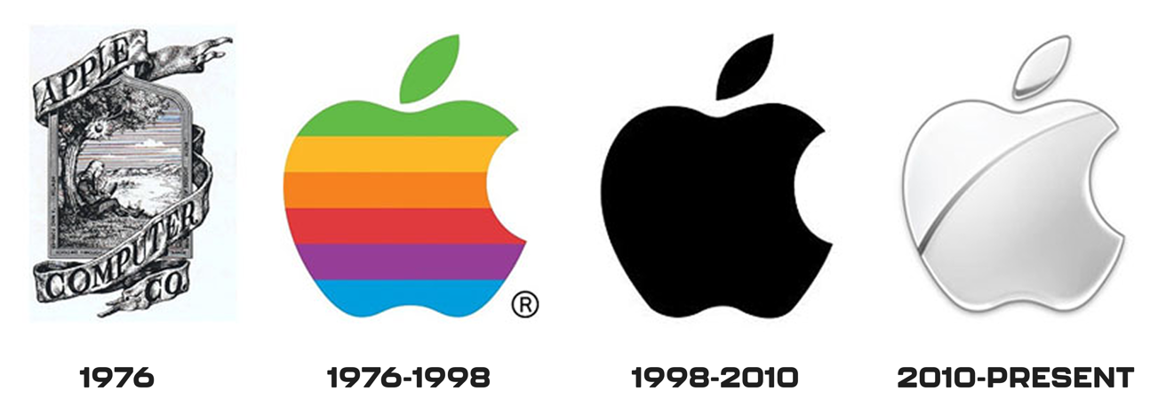
Minimalism and debranding weren’t just design trends but a status play. The thinking was: if your brand was clean, neutral, and effortless, it must be successful. Think Apple in 2010 — when most brands were loud, colorful, and full of personality, Apple stood out by doing less. Being minimal was different. It felt elevated. And it sent a silent signal: we don’t need to try that hard.

But once everyone started adopting that same, stripped down look, it stopped standing out. When everything looks effortless, nothing is original. Or memorable.
It’s Also Cheaper
There’s another reason minimalism took over: it’s budget friendly.
A single wordmark in black or beige is easier to scale across packaging, signage, and online than a complex, multi-colored logo. No custom illustrations. No distinct visual identity to maintain.
Minimalism made it easier to launch, iterate, and manufacture.
In some ways, it was a branding shortcut — clean, cost-effective, and (at least for a while) considered cool.
The problem is, you can’t shortcut personality.
Which Brands Win? The Ones That Don’t Follow
Milkify is a great example. Their branding is soft, human, and instantly recognizable in a sea of sterile competitors. You don’t confuse them with a pharmaceutical company. You remember them when you see them.
We could say the same goes for us at Nickelbronx. Our logo is based on one of our founder’s wife’s handwriting. It’s personal, a little imperfect, and completely ours. We didn’t follow a trend. We followed what felt true to us.
Your Brand Should Feel Like Your Favorite Outfit
Something you’d actually want to wear. It needs to fit who you are, not just what the market says is “in” right now. It’s really the only way to turn heads.
Branding has become less about being “professional” and more about being distinct. People don’t want to buy what you do. They buy how you make them feel.
So next time you’re thinking about a rebrand, a logo, or your visual identity, ask yourself: Does this feel like me? Does it stand out in a room full of sameness? Would I wear it on a T-shirt?
If the answer is no, we can certainly help with that.
Want a brand that actually feels like yours? Let’s build it together.


.svg)
.png)
